Little Athletics Australia: Modernizing a National Brand and Digital Experience
Led the end-to-end product design to revitalize the Little Athletics Australia brand and website, creating a modern, engaging, and user-friendly platform that supports membership growth and simplifies discovery for families.
The Challenge
Little Athletics Australia, a beloved national institution for children’s sport, faced a critical challenge: its brand and digital presence had become outdated. This was more than a cosmetic issue; it hindered their ability to attract and retain modern families in a competitive youth sports landscape.
The key problems included:
- An Outdated Brand: The visual identity failed to reflect the energy, fun, and inclusivity of the program it represented.
- Poor Digital User Experience: The existing website was difficult to navigate, making it hard for parents to find local clubs, understand the benefits, and register their children.
- Ineffective Communication: The platform did not effectively convey the core value proposition of Little Athletics that it’s about participation, fun, and fundamental skill development for all children.
The Goal: To completely reimagine the Little Athletics Australia brand and website, creating a vibrant, intuitive, and persuasive digital experience that drives membership growth and strengthens the community.
My Role: Lead Product Designer, responsible for brand strategy, visual identity, UX/UI design, and art direction for photography and marketing assets.
Little Athletics Australia faced a challenge that went beyond simply refreshing their website. The organisation needed a platform that could grow with its community, while also giving staff the confidence to manage and maintain it without technical barriers. The existing site was outdated, visually inconsistent, and difficult to update. It lacked the usability and accessibility standards required to deliver a seamless experience for members and stakeholders across the country. Staff were limited by the system’s constraints, and users struggled to engage with a platform that no longer reflected the energy and spirit of Little Athletics.
Discovery and Research
The project began with a deep dive into the “why” behind Little Athletics to ensure the new design was built on a foundation of user and business needs.
- Understanding the Audience: The primary user groups are time-poor parents seeking positive activities for their children, and the children themselves who need to see the fun and excitement.
- Competitive Analysis: I analyzed other youth sports and activity platforms to identify standards for information architecture (e.g., finding a local club) and opportunities to differentiate through a more joyful and inclusive tone.
- Brand Strategy Workshop: I facilitated workshops to distill the core brand pillars: Inclusivity, Fun, Development, and Community. These became the guiding principles for every design decision.
The Design Solution
1. A Vibrant New Brand Identity
The new visual system was designed to be a direct reflection of the brand’s energy. I developed a bright, contemporary color palette and a suite of custom, playful icons that represent the various athletic events. The photography art direction focused on capturing genuine moments of joy, effort, and camaraderie, making the brand feel authentic and relatable to families.
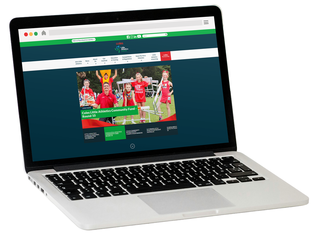
2. User-Centered Information Architecture
The website’s structure was simplified to serve the primary user goal: “Find and join a local club.” I designed an intuitive information hierarchy that allows parents to quickly understand what Little Athletics is, see it in action, and easily locate their nearest center with a prominent “Find Your Centre” call-to-action.
3. Key User Flows
Flow A: The Parent’s Onboarding Journey
- Problem: Parents unfamiliar with the sport needed a clear, reassuring path from discovery to registration.
- Solution: The design leads users through a persuasive narrative: compelling hero imagery → clear value propositions (“For Kids 5-15”) → easy “Find Your Centre” tool. The centre finder itself is a critical piece of UX, requiring a simple, fast, and trustworthy interface.
Flow B: The Digital Resource Hub
- Problem: The association needed a way to distribute official resources, rules, and news in a structured, accessible manner.
- Solution: I designed a clean, organized resource section with clear categorization and visual cues, making it easy for parents, coaches, and officials to find the information they need without frustration.
4. Visual Design & UI
The interface combines the new vibrant brand identity with a clean, accessible, and mobile-first layout. The UI is built on a foundation of clear typographic hierarchy, ample white space, and large, tappable buttons that ensure a seamless experience for parents on the go. The consistent use of custom icons and energetic color accents creates a cohesive and engaging digital environment that feels both professional and fun.
Outcome and Reflection
The launch of the new Little Athletics Australia brand and website marked a transformative step forward for the organization.
Impact:
- Delivered a modern, energetic brand identity that accurately reflects the joy and inclusivity of the sport.
- Created a significantly more intuitive and user-friendly website, directly addressing the primary goal of helping families find and join local clubs.
- Provided the national body with a flexible and scalable design system for all future digital and print communications.
- The new platform serves as a proud central hub for the national community, boosting morale and brand perception.
Key Learnings:
- Emotion Drives Action: For a family-oriented product, the emotional appeal of photography and color is just as critical as the usability of the forms. Balancing heartfelt imagery with clear UI was key to success.
- Designing for Scale: Creating a system of templates and components empowered the internal team to maintain consistency while publishing new content across the vast network of state and territory associations.
This project demonstrates the power of holistic design—where brand identity and user experience are seamlessly integrated to revitalize a cherished institution and achieve tangible business goals.