
Human-Centred Design Rooted in Purpose
The Be Well Care project began not as a technical challenge, but as a mission-driven collaboration to empower individuals and families navigating Australia’s disability support system. Be Well Care wasn’t just seeking a website; they needed a digital experience that communicated trust, warmth, professionalism, and clarity in equal measure. As the lead UX/UI and product designer, my role was to translate these values into a fully responsive, intuitive, and scalable digital platform that felt personal while remaining robust enough for operational growth.
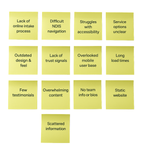
The process kicked off with discovery and immersion, I listened to the founder’s vision, understood their positioning within the NDIS landscape, and explored pain points for both carers and participants. A consistent insight emerged: people needed to feel safe and supported from the very first digital touchpoint. This insight became the north star for every design decision that followed.
UX Research & Information Architecture: Making Support Accessible
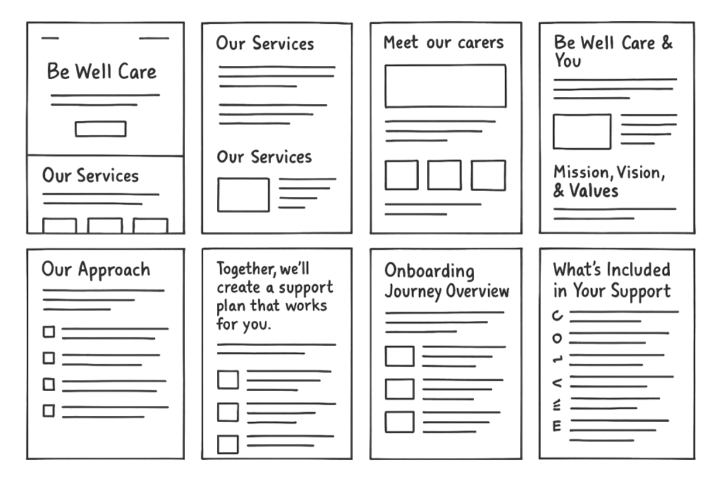
The UX strategy was anchored in simplicity, clarity, and emotional trust. My first priority was mapping user journeys across different audience types: NDIS participants, family members, coordinators, job seekers, and support workers. Each of these audiences had distinct goals and content needs from requesting support to applying for a job or learning about care services. Through this lens, I created detailed site maps and wireframes that streamlined access to essential information while encouraging engagement.
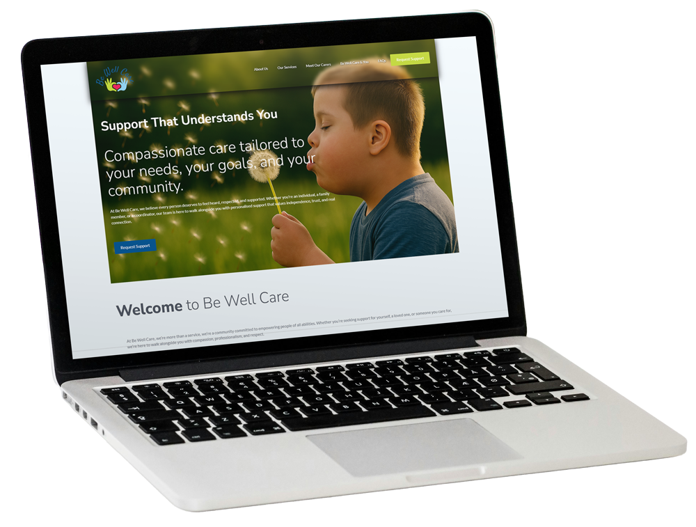
The information architecture was refined to ensure services could be browsed effortlessly and carers could be introduced in a way that built immediate rapport. I leveraged storytelling formats, staggered content, and clear CTA blocks (“Request Support,” “Join Our Team,” “Meet Our Carers”) that guided users without overwhelming them. Sections like “Be Well Care & You” and “Our Approach” were introduced to personalise the experience and answer unspoken questions with empathy.
UI Design: A Calming Visual Language
For the UI, the goal was to strike a delicate balance between professionalism and warmth. I developed a calming visual language using soft blues, rounded elements, accessible fonts, and inclusive imagery. Custom iconography and soft-focus background photos were selected to support the brand’s narrative of calm, trust, and care. Every visual element, from button styles to section dividers was tested to ensure it worked for people with visual, cognitive, or motor impairments, keeping accessibility at the heart of the experience.
The design system included reusable Oxygen components, consistent paddings, scalable typography, and dynamic layout structures for services and carers. This consistency ensured that as the website grew, new content could be added without compromising the overall UX/UI cohesion.
Product Design Thinking: Modular, Scalable & Client-Editable
This wasn’t just a website, it was a digital product ecosystem. Using Oxygen Builder 6, I implemented a modular architecture that allowed for client autonomy post-launch. Each service and carer profile was structured using dynamic custom post types, advanced repeaters, and ACF fields enabling Be Well Care’s staff to update or add content without developer intervention.
Particular care was taken with carer profiles. These included repeater fields for qualifications, certifications, and specialties, with logic to dynamically display only available content. This not only improved the front-end experience but reduced admin time for the client. I also created a custom layout system where every second “Our Services” row reverses column order to maintain visual rhythm — all controlled with minimal CSS and no hardcoding.
The website also includes:
Dynamic forms for referrals and recruitment (powered by Formidable Forms)
Editable testimonials and FAQs
Built-in fields for service area lists
Accessibility plugin ready integration
Pre-configured SEO tools and image optimisations
Client Collaboration & Handover
The project was designed to be collaborative from day one. Content delays were anticipated, and the build was structured to allow placeholder content without halting progress. Once the site reached 95% completion, I scheduled a handover meeting with the founder, walked through the CMS, and provided guidance on updating services, carers, and general page content independently. A style guide and training support were also offered to ensure smooth long-term management.
Results & Takeaways
The Be Well Care website is now a robust, scalable, and user-friendly platform designed to grow with the organisation. From a UX/UI perspective, it’s a testament to how empathetic design, flexible architecture, and client empowerment can intersect to create a truly impactful digital experience.
This project exemplifies my ability to lead cross-functional product design, develop complex yet user-friendly backend structures, and deliver elegant, real-world solutions tailored for social impact.