
Racing Australia: Designing a Unified Digital Ecosystem for a National Sporting Body
Led the UX/UI design to consolidate multiple fragmented services into a single, user-centric platform for drivers, officials, and fans, increasing engagement and simplifying complex workflows.
The Problem & Opportunity
The Challenge: Racing Australia, the national governing body for thoroughbred racing, was operating with a series of disconnected digital services. This created a fragmented experience for its key user groups, leading to inefficiency, user frustration, and a diluted brand presence.
User Pain Points:
- For Trainers/Owners: Navigating a maze of separate sites for registration, results, and handicaps.
- For Officials: Inefficient tools for managing races and accessing real-time information.


The Goal: To design and launch a unified, responsive web platform that serves as the single digital touchpoint for all of Racing Australia’s stakeholders, improving usability, engagement, and operational efficiency.
My Role: As the Lead Product Designer, I was responsible for user research, information architecture, interaction design, visual design, and collaborating with developers throughout the implementation.
Discovery & Research
User Research
- I conducted stakeholder interviews and analyzed existing user data to identify key user personas
- Competitive analysis of other digital platforms helped us identify industry standards and opportunities for differentiation
Information Architecture (IA):
- Structuring a Complex Ecosystem
The core challenge was organizing a vast amount of content for distinct audiences. I developed a sitemap that balanced clear, audience-specific entry points - The Design Solution
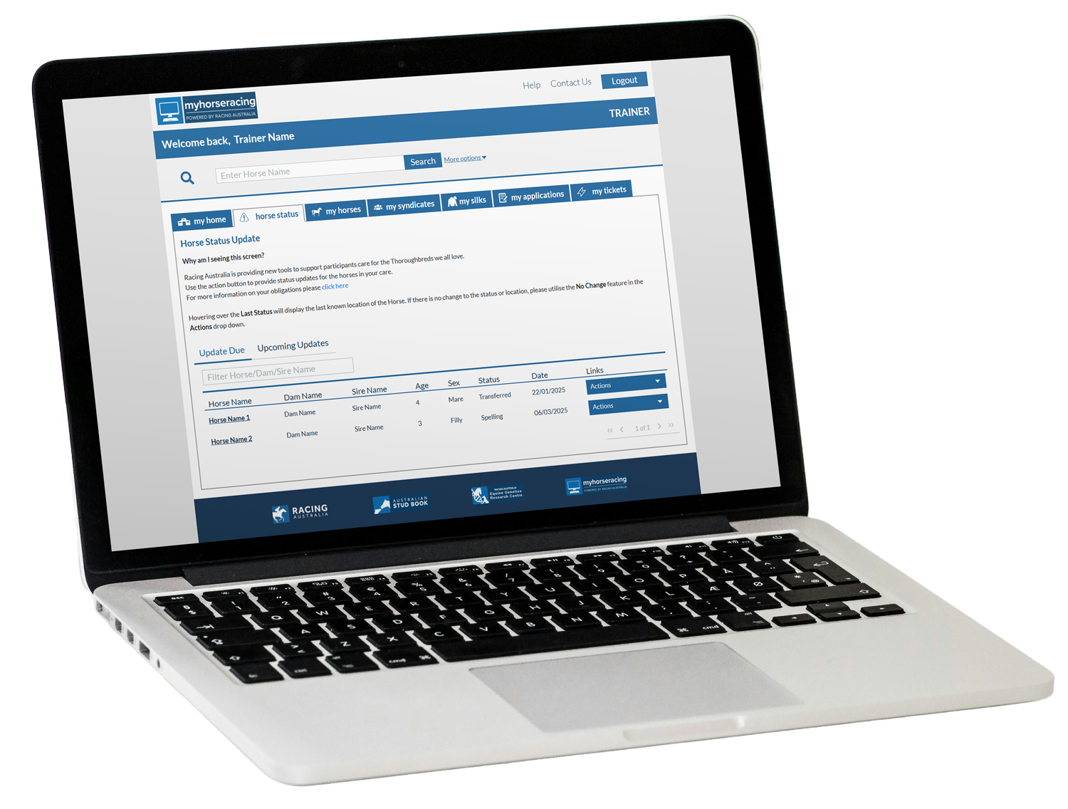
Building a Cohesive and Scalable Language:The visual design establishes a clean, professional, and data-dense interface tailored for efficiency. A restrained color palette, dominated by whites and dark blues, ensures clarity and reduces cognitive load, allowing users to focus on critical tasks and information.
The typography is clean and highly legible, utilizing a clear hierarchy to effectively guide the user through complex datasets and administrative functions. Interactive elements like tables, action menus, and filters are designed with precision, providing clear affordances and logical grouping to streamline workflows for trainers managing horse statuses, ownership transfers, and daily notifications. The overall aesthetic is utilitarian and trustworthy, prioritizing functionality and ease of use for professionals within the racing ecosystem.
Outcome and Reflection
The launch of the new Racing Australia platform successfully established a strong, unified digital identity and significantly improved the user experience.
Impact:
- Created a single, authoritative source, streamlining complex processes for participants and officials.
- Received positive user feedback on the improved clarity, ease of navigation, and modern, professional aesthetic.
- Established a scalable design system for future features and iterations.
Key Learnings:
- Collaboration is Key: Involving development early in the process was crucial for handling complex, real-time data like race results and ensuring technical feasibility.
- Balancing Audiences: Designing for multiple, distinct user groups requires a delicate balance between personalized content and a cohesive, unified ecosystem. The “I Am A…” navigation proved to be an effective solution for this.
This project was a testament to the power of user-centered design in transforming a fragmented suite of services into a cohesive and effective digital product.
Publishing Materials – Annual Reports & Factbooks
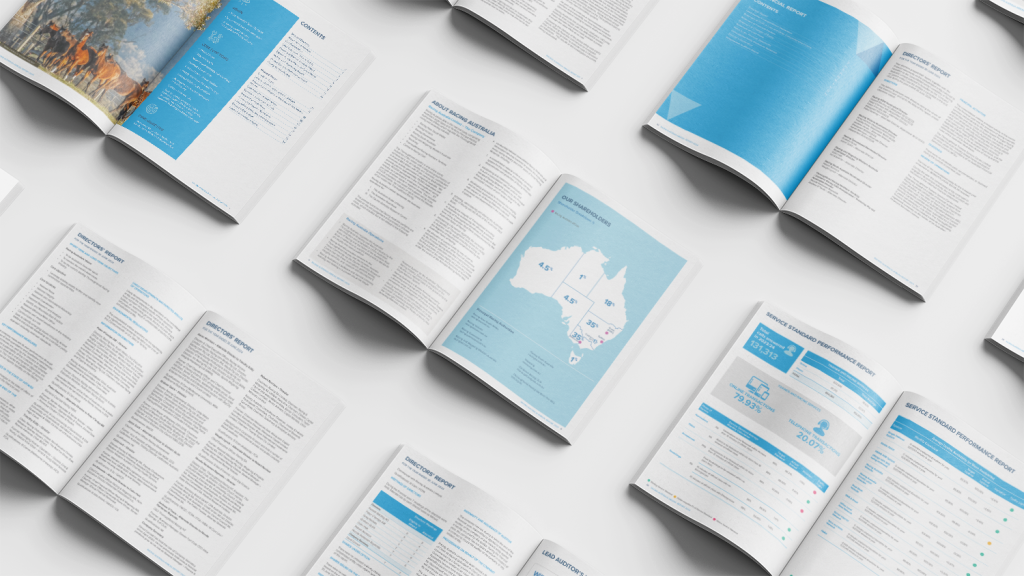
Alongside digital platform transformation, I also played a key role in the design and delivery of Racing Australia’s flagship publications, including the Annual Report and Factbook. These were not just documents but essential communication tools that needed to present complex industry data in a way that was clear, accessible, and engaging. My focus was on applying UX and information design principles to ensure consistency between print and digital formats, making the information both visually compelling and easy to navigate.
Each publication was treated as an extension of the Racing Australia brand. I collaborated with writers, analysts, and developers to ensure that data visualisations, layouts, and typography aligned with the organisation’s identity and standards. The result was a suite of professional materials that balanced accuracy with clarity, while reinforcing Racing Australia’s authority and credibility within the industry. By integrating design systems across digital and print, these reports became not only a source of information but also a reflection of the organisation’s values, helping stakeholders connect more meaningfully with the data and the story behind it.
- Racing Australia Factbook 2023/24
- Racing Australia Factbook 2022/23
- Racing Australia Factbook 2021/22
- Racing Australia Factbook 2020/21
Email Newsletter – Seamless Race Day Communications
One of the most impactful parts of my work was shaping how owners received race day communications. Imagine being an owner on the morning of a big event, perhaps during the Racing Carnival, and wanting to know when and where your horse would run. Before, this information was scattered, inconsistent, and often delayed. Through collaboration with Racing Australia, I helped in the creation of a streamlined mail system that brought all of this together.
Owners began receiving clear, timely messages with vital details about their horses, race schedules, and event logistics, all wrapped in branding that reflected the excitement and prestige of Australian racing. What started as a challenge in consistency and delivery became an opportunity to strengthen trust, create anticipation, and give owners a richer sense of connection to the sport they love.